Alan Moore
www.alanmoore.info
Not currently available
Thanks for your interest, but I am not
currently looking for a new position. Of course, if you have an offer I can't refuse, Check out
my resumé, and contact me at
or on
LinkedIn.
I bridge the gap
between UX and development. I have 25 years experience in creating, launching and maintaining
web applications and websites.
I am particularly interested in information architecture (IA) and the functional user experience (UX) design of complex workflows in long-life applications.
Most recently, I lead the user experience of web and mobile applications at fintech startup Tongo Financial.
My Work
You can read about my full work experience in my resumé, available as a PDF. It tells you all about my previous lives.
Since 2014, I have specialised in User Experience and Interaction Design. In that time, have worked on several enterprise-sized web applications, and at one startup.
Tongo Financial
At Tongo, we created a new range of products to aid the self-employed manage the gaps between their commissions. I was part of the team that designed and built the initial versions of the applications that the business runs on.
Web application
First, we built a Dashboard and self-service web app, through which customers sign up and manage their accounts.
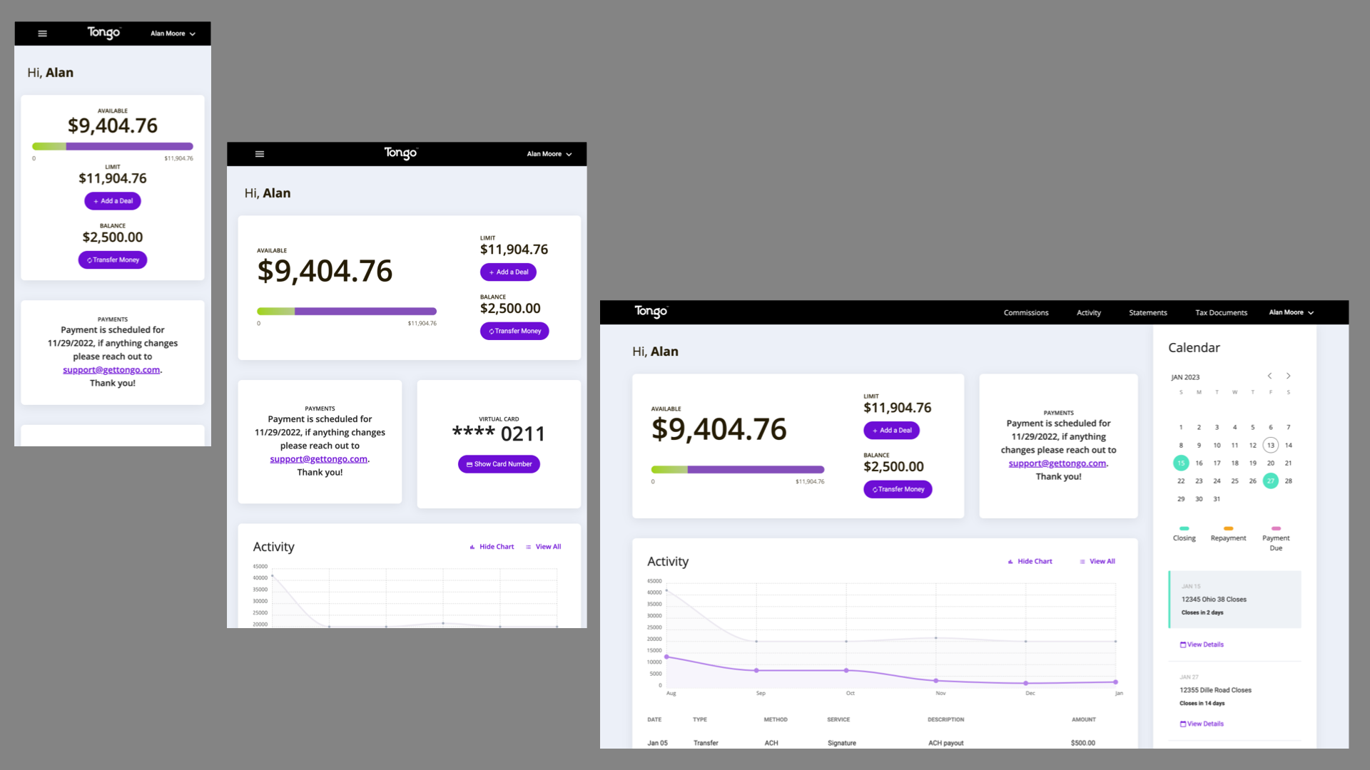 Three views of the Tongo web app Dashboard, showing mobile,
tablet and desktop breakpoints.
Three views of the Tongo web app Dashboard, showing mobile,
tablet and desktop breakpoints.
We identified that over 80% of our users were visiting on a mobile device. With this in mind, many screens in the web app were designed for mobile, and the decision was made not to pad them with extraneous visual affectations when viewed on a large screen.
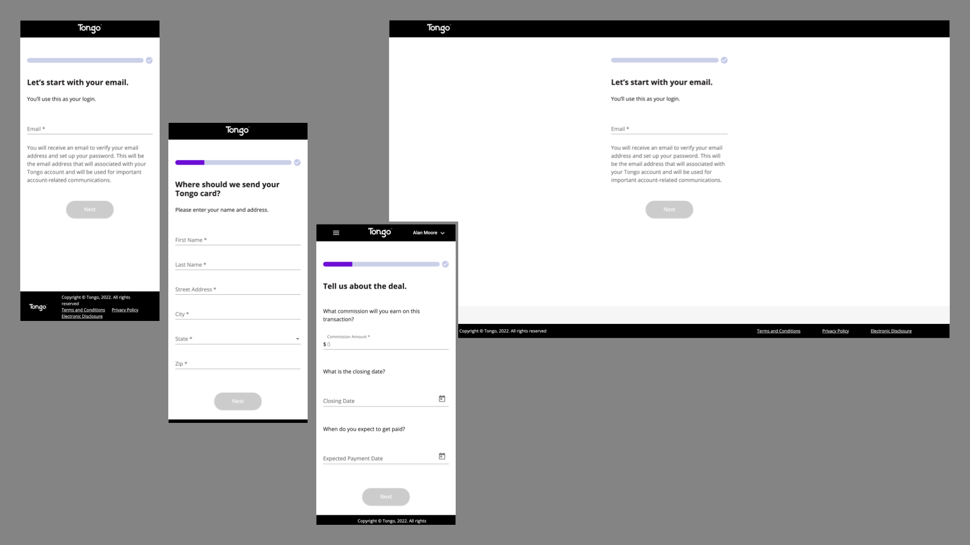 The Tongo signup flow in the web app. Three screens from the flow are presented at
mobile size, and to the right is one of those screens as presented on a desktop.
The Tongo signup flow in the web app. Three screens from the flow are presented at
mobile size, and to the right is one of those screens as presented on a desktop.
Next, a back-of-office admin system used by our staff, such as underwriters and customer support agents to run the business. This is not shown, due to containing proprietary information. I worked with an external graphic designer to polish this interface.
iOS and Android apps
Most recently I have produced designs for the iOS and Android apps, as we identified native functionality which could not betaken advantage of via browser.
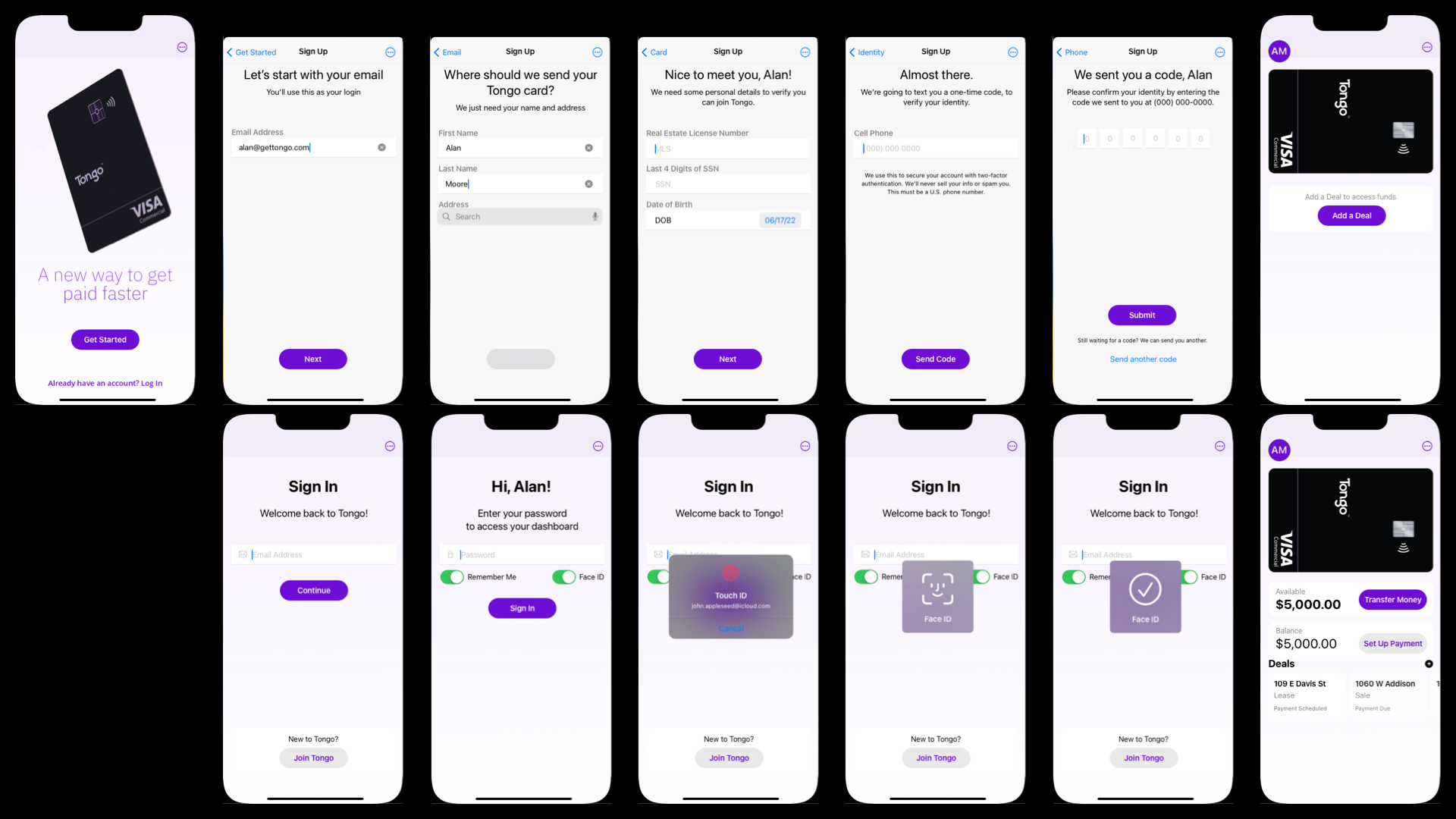 Tongo iOS app
Top row: The Tongo iOS app signup flow, with the first login view of the dashboard to the right.
Bottom: Log in flow, showing password, Touch ID and Face ID flows, plus a view of the dashboard once the app is being used.
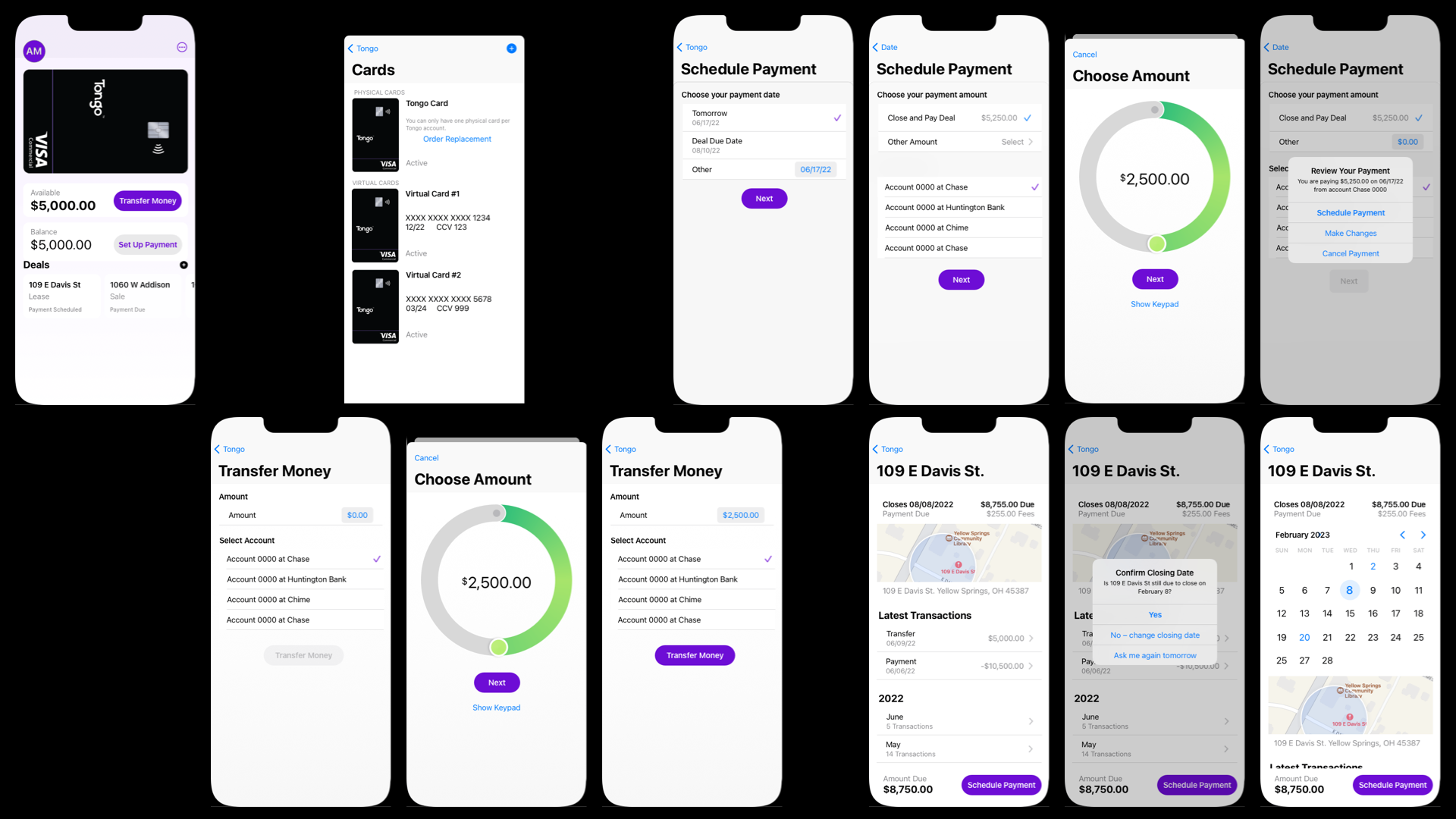 Various screens from the Tongo iOS app.
 Top row, from left to right: Dashboard, Manage Cards, and the Schedule Payment flow.
Bottom row: Transfer Money flow, Deal details view, with Change Closing Date flow.
Background Materials
As a startup spinning up a completely new product and the technology to support it, we iterated often. We also went through a rebranding, and several different potential company names and Corporate IDs were provided by our marketing firm. This is a selection of supporting materials from the 2 years spent building and launching Tongo.
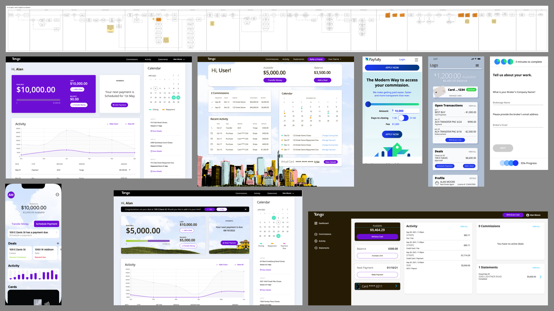 Top Row: An early user flow for user sign up.
 Middle, from left to right: Two alternate versions of the web app dashboard. Three mobile designs, showing the home page, a dashboard based on a rejected design, and part of the sign up flow using an early version of the corporate ID.
Bottom: An old version of the iOS app dashboard, an older version of the web app dashboard, an unused early version of the web dashboard for very wide screens.
Studio Designer
Most of my time at Studio Designer was spent on Studio Core, the accounting and project management software. Embedded in a fully-remote, high performance development team, we launched version 2.0 of the product, replacing the Salesforce-based Studio Webware with a 100% custom software stack.
Studio Core
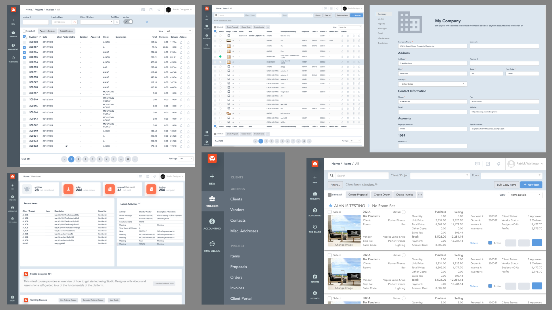 Various screens from Studio Core. This was Mostly made up of tabular data and form
input screens. We customised a Bootstrap template I gave it more muted colors with a very consistent look
and feel. This was living software used live by thousands of people at once to run their businesses.
Various screens from Studio Core. This was Mostly made up of tabular data and form
input screens. We customised a Bootstrap template I gave it more muted colors with a very consistent look
and feel. This was living software used live by thousands of people at once to run their businesses.
Most of my output was in the form of wireframes, user flows, and interactive prototypes.
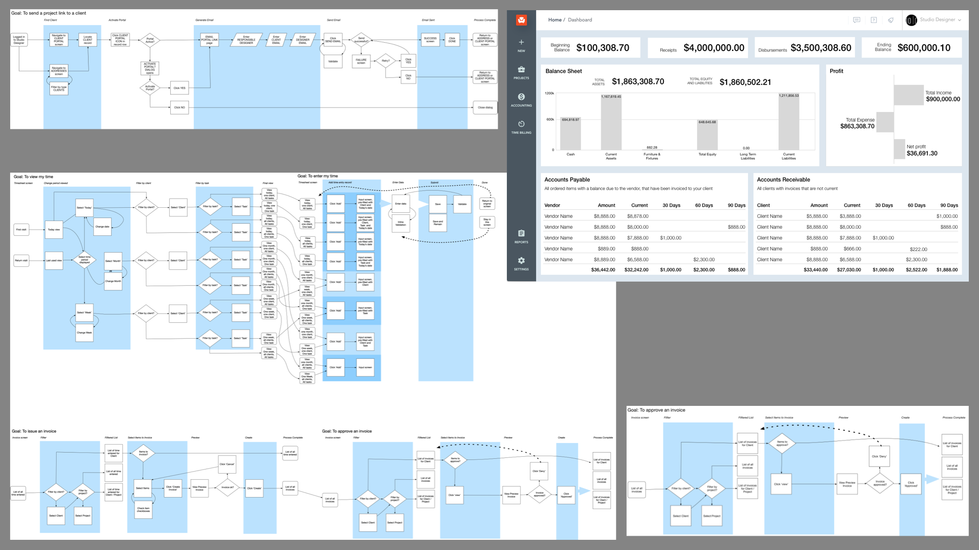 Background materials from development of Studio Core. Here are three user flows,
two simple, one complex, and a wireframe design for an Accounting dashboard.
Background materials from development of Studio Core. Here are three user flows,
two simple, one complex, and a wireframe design for an Accounting dashboard.
Client Portal
Alongside Core, I worked on sister products like Client Portal, a client self-service application.
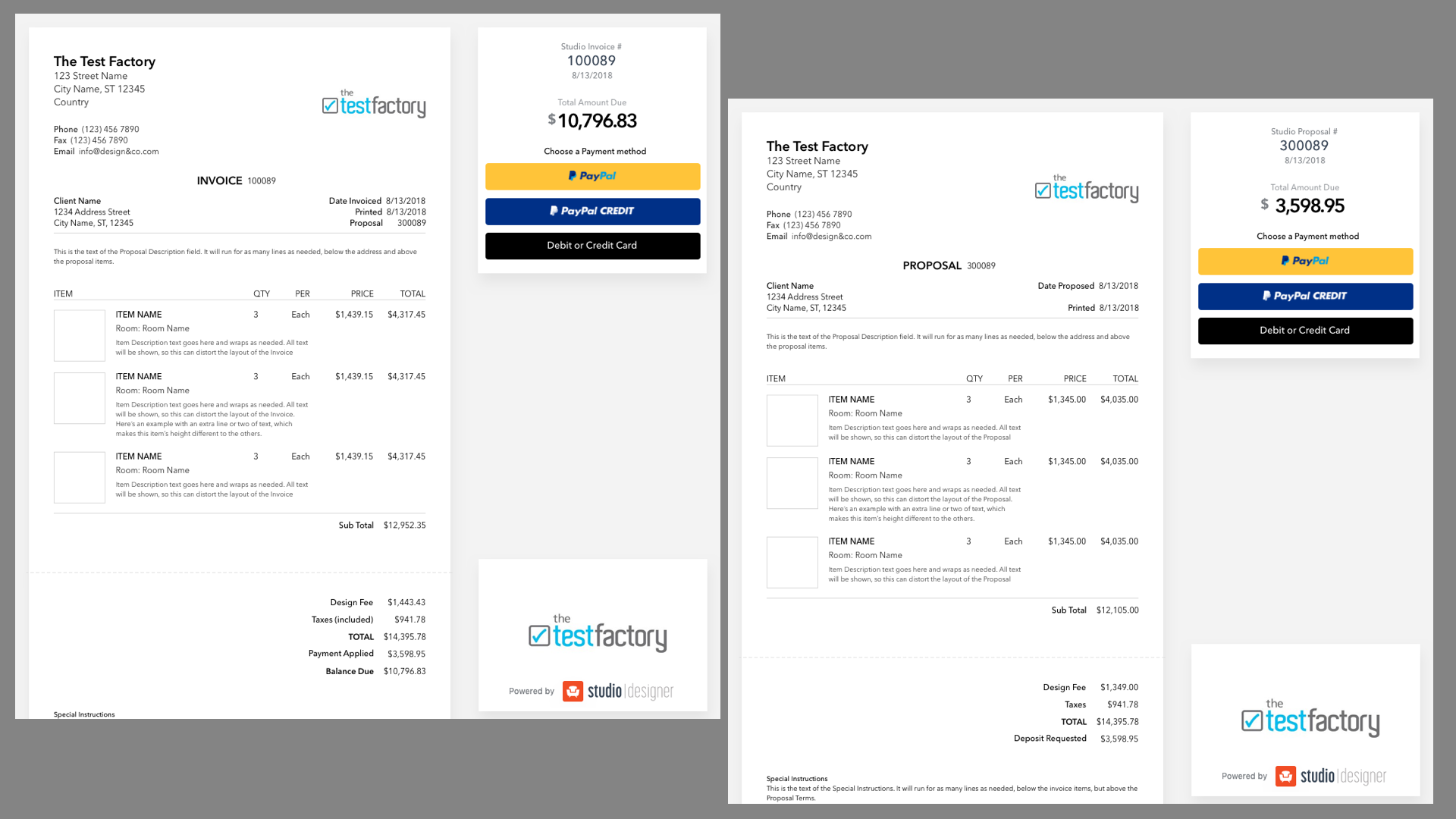 Two designs showing the redesigned, more consistent look of proposals and invoices
presented by designers to their clients using the Client Portal. The document part of the screen is designed
to resemble a paper document, but also scale with the browser viewport.
Two designs showing the redesigned, more consistent look of proposals and invoices
presented by designers to their clients using the Client Portal. The document part of the screen is designed
to resemble a paper document, but also scale with the browser viewport.
Vendor Portal
The Vendor Portal was a doomed enterprise that required some quick thinking and action. It had a very long gestation period that produced the wireframe at top left and many rejected designs. These were enough to decide to build the product.
The Senior Director of Engineering and I built and launched the Portal in under two months with limited requirements, applying best practices in lieu of any design or detailed workflows. As it contained everything we needed to build a rich site, I selected Kendo UI, then learned it and implemented it in HTML and CSS.
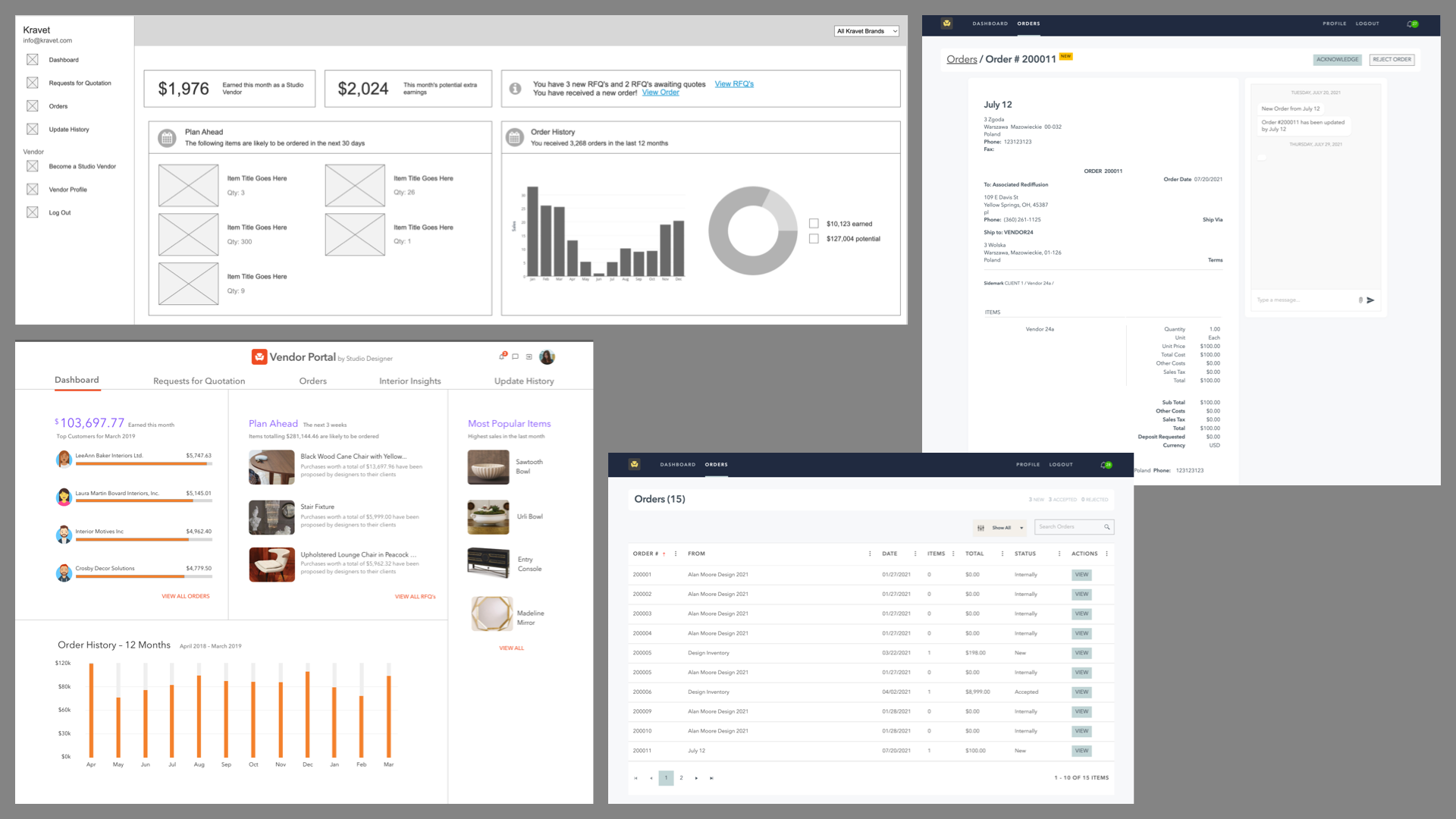 This figure shows two rejected dashboard designs from the initial gestation period
on the left. The two screens on the right show the Order Listing and Order Details screens.
This figure shows two rejected dashboard designs from the initial gestation period
on the left. The two screens on the right show the Order Listing and Order Details screens.
ACGI Software
ACGI provided Association Management (AMS) and Certification to clubs and associations, from five member group medical professionals to the PGA. I was embedded in their development team, working on the base version of Association Anywhere, from which all custom installations were derived.
Association Anywhere
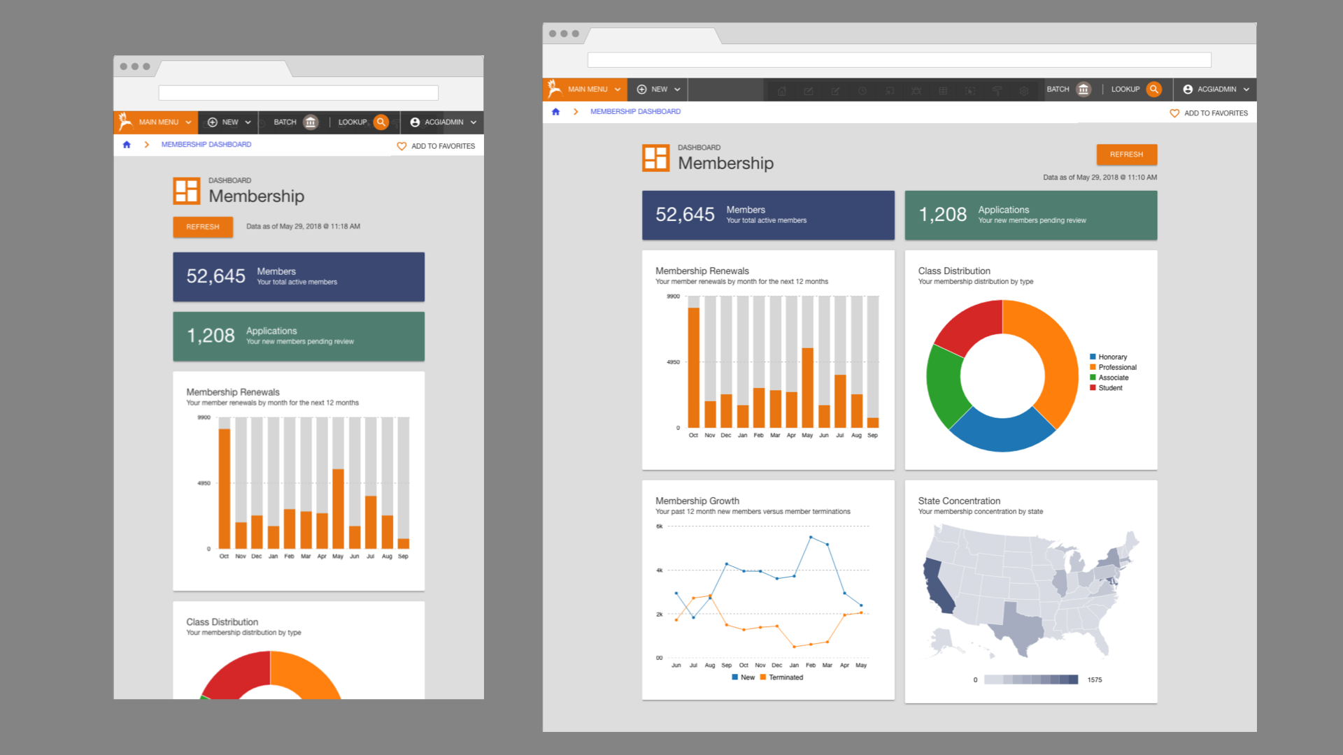 A design for a dashboard in Association Anywhere. Shown at two screen sizes: mobile,
and desktop. This was the first produced for an intitiative by the Product Manager to create dashboards for
all 10 primary modules in the software suite.
A design for a dashboard in Association Anywhere. Shown at two screen sizes: mobile,
and desktop. This was the first produced for an intitiative by the Product Manager to create dashboards for
all 10 primary modules in the software suite.
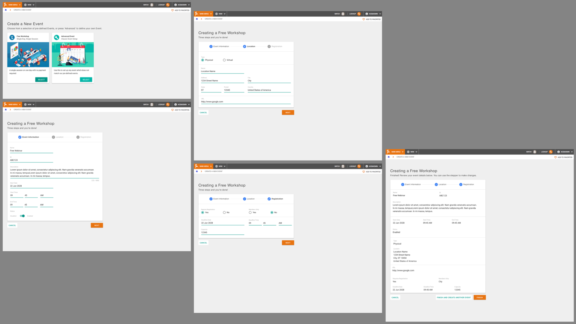 As a sprawling suite of software in active development for 16 years, some screens were
incredibly old and outdated. The Event Creation screen in the Meetings module was a screen built using late
90's technology. We used this as an opportunity to update the technology to the newer Oracle Apex templating
system, and introduce a new Material Design design language. We expanded the New Event screen to a full Wizard
that walked the user through the process in a more understandable manner.
As a sprawling suite of software in active development for 16 years, some screens were
incredibly old and outdated. The Event Creation screen in the Meetings module was a screen built using late
90's technology. We used this as an opportunity to update the technology to the newer Oracle Apex templating
system, and introduce a new Material Design design language. We expanded the New Event screen to a full Wizard
that walked the user through the process in a more understandable manner.
One project with a huge amount of reach was the complete redesign of the Association Anywhere navigation. A complex information architecture for over 1,400 pages.
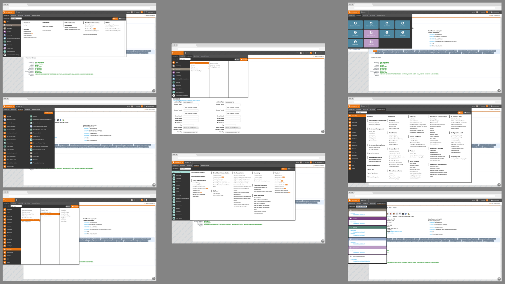 Top left: Navigation of one module, presented as a mega-menu. The modules are listed on the left.
Top center: Navigation of one module, presented in a drill-down column stucture.
Top right: A view of recently visited Member and Business records.
Middle left: A menu of per-user Favorites from across the entire application.
Middle right: The Admin section presented as a mega-menu.
Bottom left: The admin section, presented in columns.
Bottom center: The reporting module, shown as a mega-menu.
Bottom right: Search results.
Other, less glamorous projects included an initiative to integrate Social Media logins with the self-service portal used by association members.
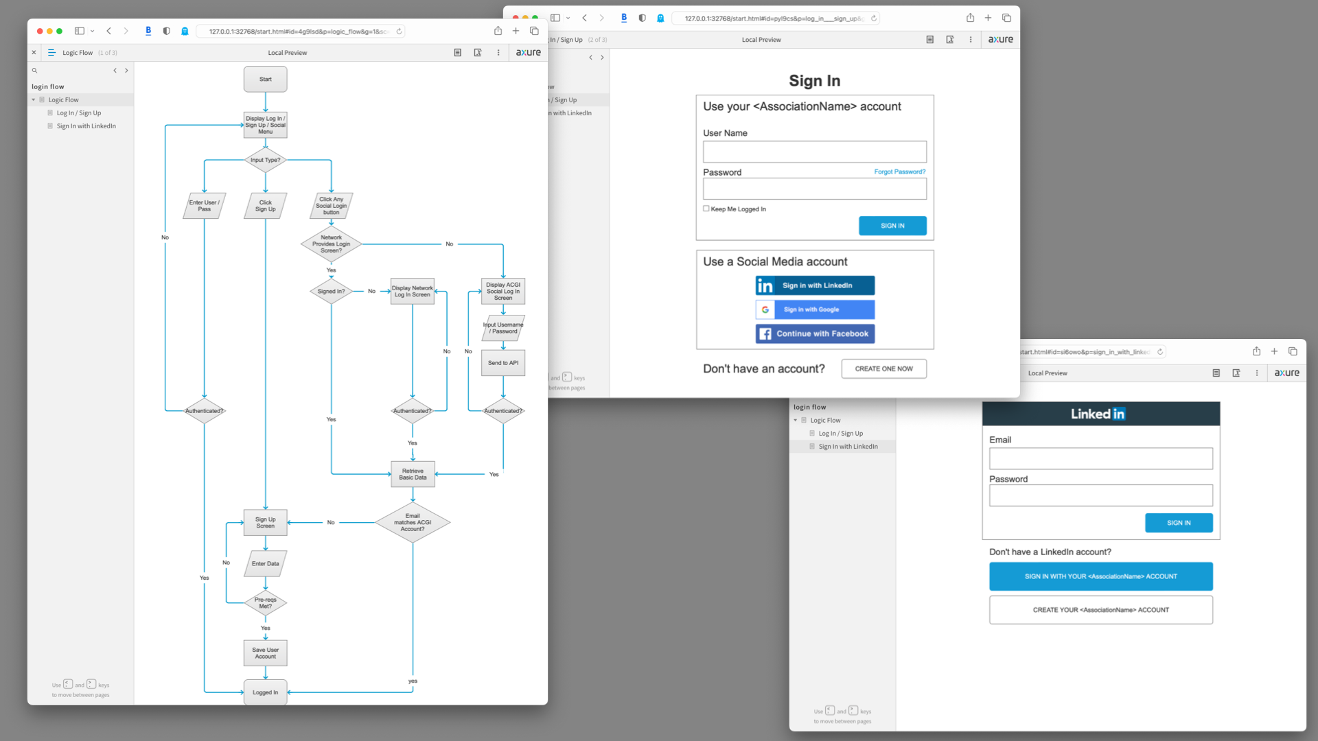 Background materials from the Social Login project
 From left to right: the logic flow, two wireframe screens from the Axure interactive prototype showing the initial sign in screen and an example integrating the LinkedIn sign in.
Regent Education
Regent's main product was Regent Enterprise Management, a SaaS suite for managing and dispersing financial aid to students.
Financial Calculator
The Student Financial Calculator would accurately predict the cost of attending college for a student, and show any available grants or loans, providing a final, out-of-pocket price for attending school.
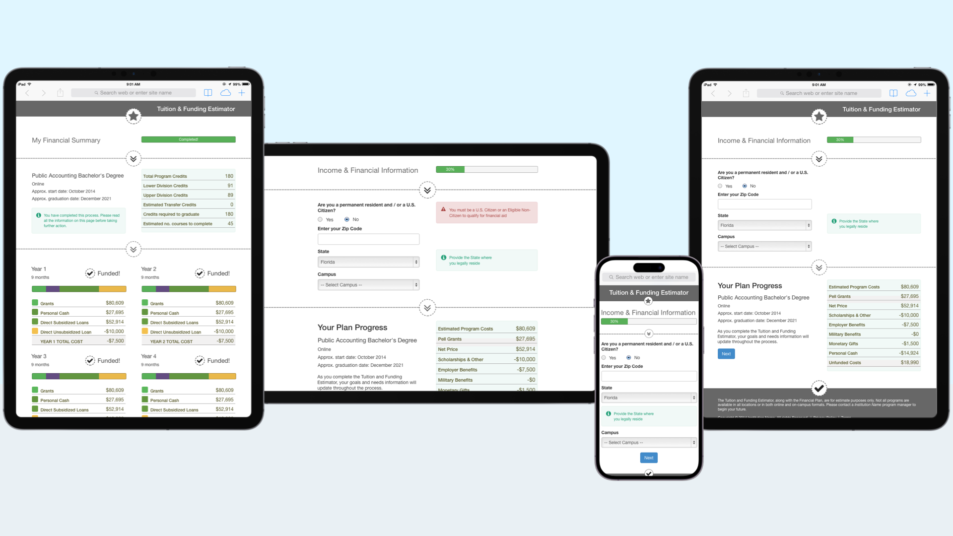 The Student Calculator was designed to be branded by each
institution that used it, hence the basic Bootstrap theming.
The Student Calculator was designed to be branded by each
institution that used it, hence the basic Bootstrap theming. Left to right: The fianl summary screen, as displayed on a portrait tablet; The same screen showing an in-progress application, on a computer/landscape tablet, a phone and a portrait tablet.
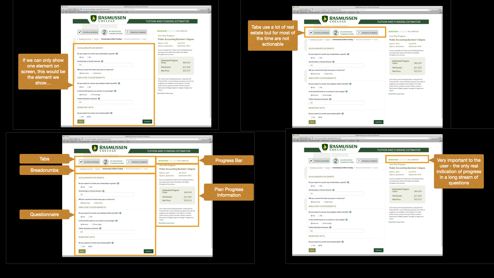 Background materials taken from a presentation introducing the new design for the
Student Financial Calculator. TThe analysis was applied to an earlier version of the financial calculator
produced for one institution, as opposed to this new version which was to be available to any institution
using Regent Enterprise Management.
Background materials taken from a presentation introducing the new design for the
Student Financial Calculator. TThe analysis was applied to an earlier version of the financial calculator
produced for one institution, as opposed to this new version which was to be available to any institution
using Regent Enterprise Management.
REM
Due to the functional complexity of most screens, Much background material was produced.
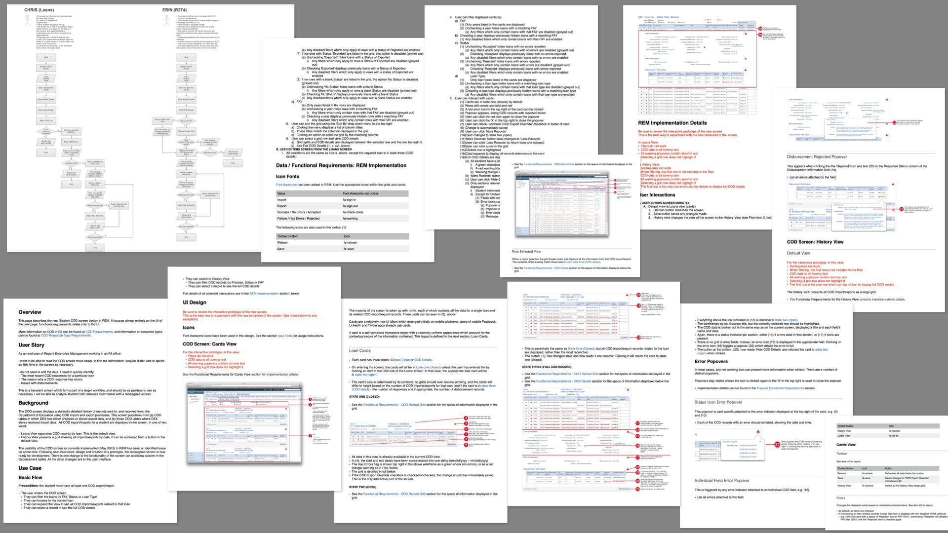 For this screen I interviewed users, producing the workflows presented top left. Next, I created a
fully-interactive wireframe prototype in Axure, and then produced requirements for the developer to
build from. The screenshots in the pages displayed are taken from the Axure prototype. The pages shown here
were made available in the company documentation intranet, and then added to by a Business Analyst for back-end
and database requirements.
For this screen I interviewed users, producing the workflows presented top left. Next, I created a
fully-interactive wireframe prototype in Axure, and then produced requirements for the developer to
build from. The screenshots in the pages displayed are taken from the Axure prototype. The pages shown here
were made available in the company documentation intranet, and then added to by a Business Analyst for back-end
and database requirements.
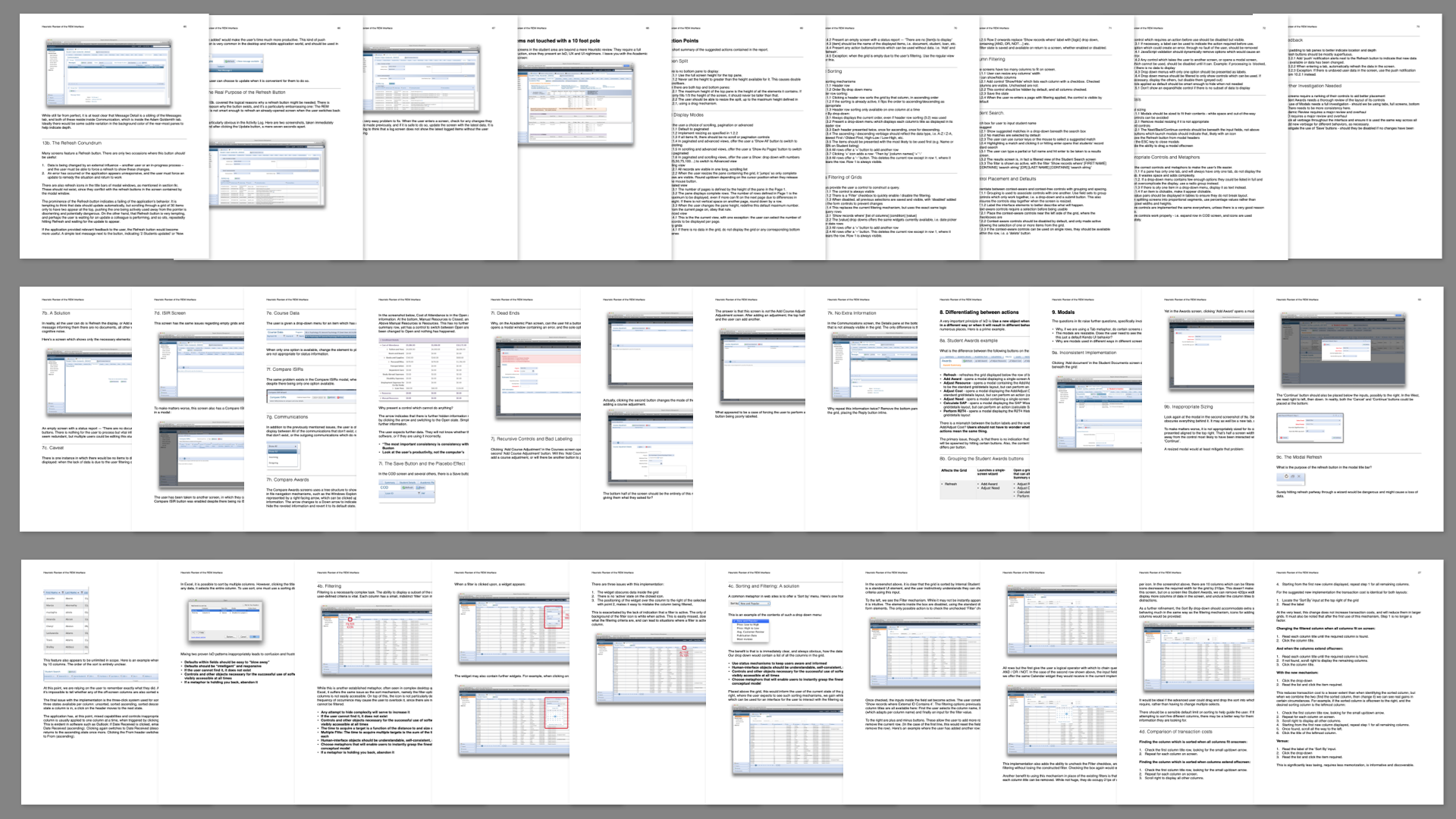
This was a beast of a project: to provide a heuristic review of the entire Regent Enterprise Management software suite. It turns out that groups of developers doing their very best with no UX guidance for over a decade leads to a lot of issues.
 These pages are taken from the document for the Student Management
module. This produced over 70 pages of documentation, annotated with screenshots.
These pages are taken from the document for the Student Management
module. This produced over 70 pages of documentation, annotated with screenshots.
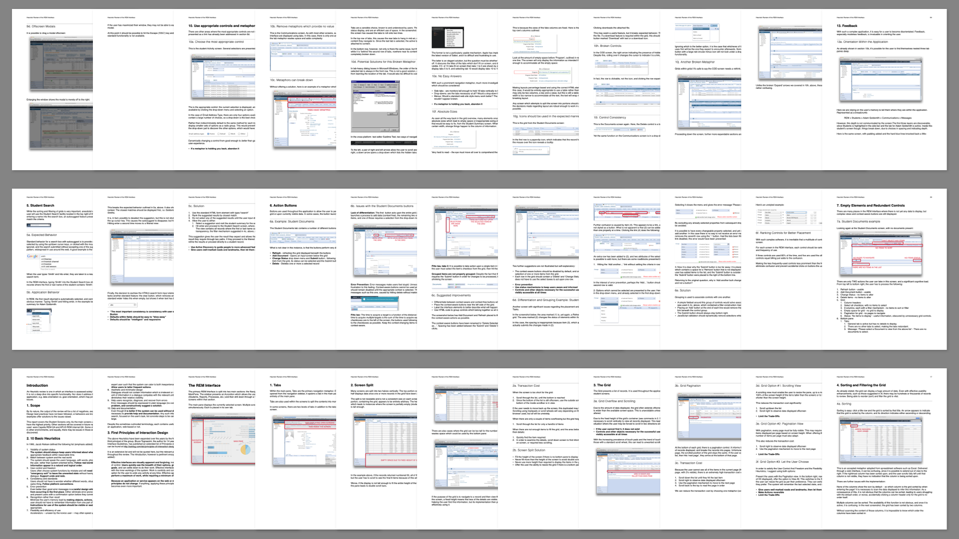
 Yet more pages from the heuristic review. I've presented these small enough to
obfuscate any proprietary information, although I doubt many of these issues are relevant 8 years after I
produced this document.
Yet more pages from the heuristic review. I've presented these small enough to
obfuscate any proprietary information, although I doubt many of these issues are relevant 8 years after I
produced this document.
How I Work
I have been happily working remotely for most of the last eight years. I live in beautiful Yellow Springs, OH with my wife, five cats and a pit bull. I prefer to work on Macs, where I have access to a command line and a good-looking UI. I work mostly in Sketch and Axure Pro, with side trips to code in WebStorm and I dip into Figma and Adobe Creative Suite as required.
Resumé
In case you missed it, here's another link to my resumé.
Talk to Me
Maybe you'd like to talk to me. You can email me at or message me on LinkedIn. Recruiters: If you are approaching me about a job, I'm only interested in full-time employment, 100% remote, and you should disclose the salary range when you contact me.
Colophon
Copyright © 2004–2023 Alan Moore. Built in HTML and SCSS with CodeKit. No tracking and only 9 lines of Javascript. CSS extended from Tufte CSS. Hosted by Opalstack. Fonts are RealTime and Popgod.